Where the wind comes sweeping down the plains.....
OK, here's my entry, from my home state of Oklahoma (Motto: We're almost a hundred years old!). And here, I include a picture that I found on the web because of the caption:
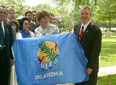 "Gov. Brad Henry presents a flag of
5 Comments:
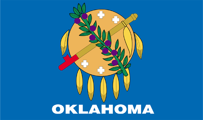
OK, at least according to the official explanation we got in 4th and 9th grade Oklahoma history classes, the symbolism is like this: (but first, note: this is not the seal of the state - they came up with a new design for the flag - so bonus points there) The shield is an Osage indian warrior's shield (Oklahoma = Choctaw for "red people"; Oklahoma is home to 60+ Indian tribes who were shuffled off to the state from all parts of the country when whitey got a hankerin' for more land. The state came into being with a symbolic marriage (they actually had a bride and groom standing in) between Oklahoma Territory and the truncated Indian territory. Crossing on the shield are the olive branch and the peace pipe, the two symbols of peace for white folks and Indians. The plus-shaped stars are, I think, representative of either stars or of some higher powers in Native American cosmology.
Frankly, they should lose the "Oklahoma" text at the bottom. I've always liked both the ideals and the symbolism of the flag, even if the actual history of relations in the state between Indians and whites has not always so placid or honorable. Note, for example, that the state is called "The Sooner State." Sooners were those who, when the reservations were broken up and opened to white settlement, snuck in ahead of time during the land runs to steal land. Boomers ("Boomer Sooner" is OU's fight song) are those who agitated to take as much land away from Indians as rapidly as possible. But I'd give it, say, a 7 or 8 out of 10 for effort and symbolism.
By DrSchnell, at 1:08 PM
OK...When G-Had said that a flag should be so simple that a 10-year old can replicate it, I don't think he meant that it should be so simple that it actually looks like a 10-year old designed it.
Cartoonish, and suffering from the same crest on blue background issues as our previous flags.
But, by far the best flag we've seen to date. I like that you could probably actually tell that it was the Oklahoma flag if you were standing under a flagpole flying it, unlike the Nebraska-Kansas type flags, which all look the same until you're within 6 inches of them.
Even though it's relatively simple, there are lots of small features - leaves, etc., that are cluttersome.
I don't have this flag, but I don't love it.
Final score: 4.31
By m, at 8:48 AM
Points for a peace pipe.
By girl, at 2:56 PM
In a brief defense of the cartoonish drawn-by-a-ten-year-old look of the flag, that has more to do with the crappy MS-Paint version of the flag that I found than with what it actually looks like.
By DrSchnell, at 11:13 AM
I should relax my position on complicated designs. Until we get a nuclear winter or a comet strike, flag makers will have the ability to create consistent and sophisticated flags.
I like the shield-y thing, and the feathers. Ditch the state name from the bottom and remove the plant draped across the design. That would give it an 9/10.
However, as it is, it only gets a 7. (K, thanks for telling me that the design is NOT the seal, I would have only given it a 5/10 if I mistakenly thought that!)
7/10
--gh
By BlackLineFish, at 6:24 PM
Post a Comment
<< Home